
 Go Home
Overview
Rose-Hulman has a degree planner website that allows students to plan out their 4-year plan. However, the website is outdated and has a lot of space to improve. As a result, our team picked it as the subject of our independent study project. This is a case study to show our process of developing a better user experience for the website.
My Role
I was one of the two students responsible for this project. We worked as UX designers, and I as the team leader. In addition to designing the UX, I managed the project's plan, coordinated with another senior capstone project team to combine our project with theirs, and made reports of the project to our advisor.
The Team
The team consisted of Sooyoung (Stella) Park and myself as the UX designers with Dr. Hollingsworth as our advisor. Youmin Park helped creating the graphics and visuals, though she was not enrolled in the independent study.
Main Tasks
- Users Insights and Ideation
- Research and Interviews
- Brainstorming and Designing
- Wireframing and Prototyping
Team Members

Mohammad Baqer
UX Designer

Sooyoung Park
UX Designer

Dr. Joseph Hollingsworth
Advisor

Youmin Park
Graphic Designer
Design and Research Tools

Figma
Wireframing
Prototyping

Photoshop
Graphic Design

Google Forms
User Survey

User Interview
Users Insight
Offering new version of Degree Planner required getting information from current students. Before start building the interface, it was important to understand what the student's needs are.
Surveys
We conducted a campus-wide survey to gather the needs of the students; Asking about their needs and the shortcomings of the current solutions. We’ve got:
46
Survey responses
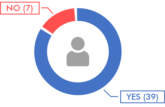
Have you ever used the Degree Planner website?
How will you rate your experience using Degree Planner?

How long did it take you to make your 4 year plan?

87%
said the longest part of making a degree plan was trying to know if their plan satisfies their declared majors
73%
wished if there was a way to know when a course is offered within the Degree Planner
Personas
By gathering data from Rose-Hulman students, we were able to come up with three personas that users of the Degree Planner website generally fall into. These are the highlights for each persona:
1. Incoming Freshman

2. Double Majoring

3. Switching Major

Alvina Lee
17-19 years old
They came to Rose-Hulman, without having much knowledge about the degree requirements, and are required to make a 4-year plan for their advisors.
Khalid Sena
17-22 years old
They are in Junior year and interested in other majors in addition to their original major and want to see if they can add double major or add more minors and still graduate in 4 years.
Gordon Phoon
18-21 years old
They finished up their Freshman year realizing they are interested more in another major. They do not have enough knowledge about the new major’s degree requirements. They want to verify if they can graduate in 4 years with the new major and how the courses taken in Freshman year counts toward the new major.
The Solution
Context
Each student receives a sample flow chart corresponding to their major. We tried to use that chart as an inspiration for our design as well as trying to be consistent with it since every student is familiar with such visual.

Low-Fidelity Prototyping
We used Figma to make a low-fidelity wireframe of our proposed design as well as to turn into an interactive prototype. After doing so, we interviewed multiple students with different majors, number of majors, years and backgrounds. Here’s the results :
Wireframe V1

Main

Left Menu

Adding a Course

Hovering Over a Course

Requirements Menu

Showing Missing Requirements
Evaluation
After making the mockups, we started interviewing students to receive some feedback on our designs, after that, we would do the required changes. Then, we would do the process again until we are ready to move on to the next phase. Here some of the feedback that received during 4 iterations :
“Maybe include a color blindness mode for the green and red”
“I would like to see the number of credit hours for courses and per quarter”
“I prefer it if it had only one side menu instead of two”
“It would be cool if we were able to drag and drop the missing course from the degree requirements menu”
“I would like it to look more like the flowchart, such as coloring. Also, I would like to place courses as it is shown on flowchart so I can put all the humanity courses at the bottom, major requirements at the middle, and other science electives at the top”
Based on this feedback we were able to make the following changes :
Wireframe V4

Credit Hours in Courses and Quarters

One Menu For Both
Search and Requirements

Requirements Show As Draggable Courses

New Settings Menu

New Grid View
High-Fidelity Prototyping
After multiple rounds of low-fidelity prototyping, and reaching a point where we started feeling confident about our design, we started moving on to the High-fidelity prototyping phase.
For that, we started picking design elements such as fonts, colors and visual language.
Design

We used Rose-Hulman's Brand Identity Guidelines 2.0 as a source for our design language. We used the recommended font, and in addition to using the proposed primary colors, we choose the secondary colors to go with them.
Font and Colors
Futura
A B C D E F G H I J K L M N
O P Q R S T U V W X Y Z
a b c d e f g h i j k l m n
o p q r s t u v w x y z
1 2 3 4 5 6 7 8 9 0
Primary Colors
Secondary Colors
Iteration
After using these elements we went again through multiple rounds of proposing design alternatives, prototyping and evaluation.
3 iterations later, we reached to our final design :


